Opply: dashboard redesign
Role: Senior Product Designer
Year: 2024
Impact: 3x faster task completion · +350% increase in dashboard engagement
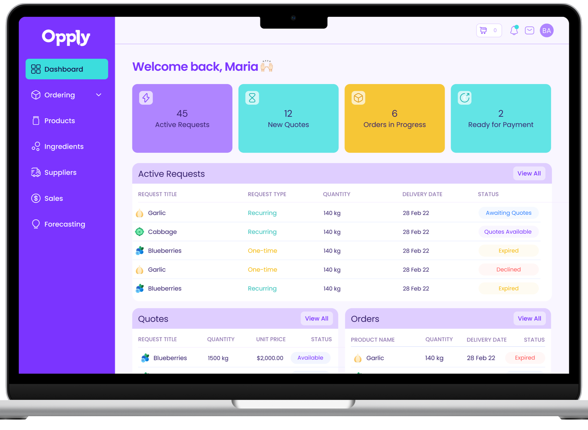
A dashboard redesign that transformed Opply’s ingredient-sourcing platform into a clear, confident workspace - helping food and beverage brands go from “Where do I start?” to “Order confirmed.”
About Opply
Opply helps small food &beverage brands find, compare, and order ingredients from trusted suppliers.
As the sole Product Designer, I led the end-to-end redesign of the buyer–supplier dashboard - turning a complex process into a simple, guided experience.
The challenge
Opply’s first-generation dashboard was underutilized, chaotic, and didn’t give users the information they needed to act.
Buyers weren’t sure what to do next.
Suppliers missed quote updates.
Conversions stalled.
Hotjar analytics confirmed the issue:
Brands spent an average of 1m 38s on the dashboard.
Suppliers spent 1m 53s.
Few completed key actions before leaving.
The dashboard had become a blocker - hard to navigate, difficult to track, and missing the clarity users needed to move from request to order.
Old dashboard:
Discovery
User research:
To understand why users were getting lost, I ran 8 remote usability sessions with Opply buyers and suppliers and combined findings with existing feedback into a shared research repository.
Through interviews, testing, and analytics, the friction points stood out:
People spent time on the dashboard but didn’t complete key actions.
Quotes and orders were buried under tabs.
Users wanted clarity, not more features.
Personas:
I used our personas to map new insights and refocus on what really mattered: clarity, control, and connection.
Buyers needed visibility - seeing progress and next steps.
Suppliers needed flexibility - owning their quoting and communication.
These personas anchored my ideation workshop and kept design decisions user-driven.
Defining the problem space:
Working with product, we mapped every friction point across the buyer–supplier journey, plotting each against reach, impact, and effort to find where design could have the biggest effect. We then visualized these insights in value-proposition maps to clarify each user’s jobs, pains, and gains.
The solution
The guiding principle was simple: “Show people what to do next.”
The team aligned quickly, focusing on simplifying the dashboard - the biggest blocker for both sides of the marketplace.
Working closely with developers, I mapped usability issues, sketched quick solutions, and tackled complexity early.
Then, using low-fidelity prototypes, I tested flows with real users. Within minutes, they completed tasks that had previously caused friction - calling the layout “obvious.”
That fast, collaborative validation de-risked the build and set a clear path for the high-fidelity redesign.
Key improvements:
Dashboard
Clear “to-do” cards for pending actions.
At-a-glance overview for quotes, orders, and messages.
Progressive prompts (“Review → Accept → Order”).
Modular grid that adapts to mobile and desktop.
UI & visual design
Simplified hierarchy
Consistent spacing and calm typography.
Neutral palette with Opply’s branding
Inclusive tone, reduced clutter.
System & handoff
Built as Figma components for easy dev reuse.
Design tokens and layout logic documented for scale.
Results
Metric
Change
Task completion speed
3x faster
Dashboard home page engagement
+350% increase
-60% increase
Dashboard confusion reports
Role and collaboration
Led discovery, user research, flows, wireframes, and final UI.
Partnered with product and engineering to test and iterate fast.
Defined design principles for clarity, consistent UI and a speedy build.
Building for growth
Continuous discovery kept the team close to real user needs and informed every design decision.
Clarity built trust - and trust drove conversion.
Simplicity made the experience scalable.
Early collaboration across design, product, and engineering surfaced complexity upfront and kept delivery smooth. Shared Figma components sped up development and ensured visual and UX consistency.
As Opply grows, we’ll continue to evolve the dashboard through live analytics and ongoing user feedback - this version is just the beginning.


